The mastery of one’s medium is the degree to which that percentage can be increased, the degree to which the artist’s ideas survive the journey—
— Scott McCloud
Understanding Comics
Chapter 11
Visual Art

"I was just trying to make movies on paper."
Read More »
"The 180 degree rule is broken all the time. You have these quick cuts of flashy imagery to hypnotize you into paying attention…"
Read More »
"I also make a point to young artists who show me page after page of characters hitting each other that they have to learn to draw the real world…"
Read More »The various visual storytelling techniques developed over the last century were influenced and developed by a number of talents. Although comics are the predominant static visual storytelling media, where the finished deliverable itself is truly rendered from computer of the mind; interactive games and 3-D animation has opened up even more opportunities for the artist, in film, comics or animation.
Many of the following techniques and formulas spawned from different visual storytelling media, but their core messages has found its way into media other than where it originated, thus infusing new life. Even something as simple as word balloons and their placement contributes to interface design, either in interactive games or DVDs, or in advertising and art. A designer of any interface between man and media would require knowledge to properly juxtapose words and pictures. As culturally we become more visual and right-brain dominant, designers and artists will need to learn proper word placement and eye path design; something comic books have been doing for a century.
A designer of any interface between man and media would require knowledge to properly juxtapose words and pictures. As culturally we become more visual and right-brain dominant, designers and artists will need to learn proper word placement and eye path design; something comic books have been doing this for a hundred years.
There is a certain uniformity to how the human mind has learned to read both words and pictures, and even though many people prefer certain visual storytelling styles and media over others, this doesn't discern the fact that when moving beyond the "illuminear" magazine or newspaper and integrate specific dialogue and narration to pictures, many of the same rules developed by Winsor McCay, Jack Kirby, Hal Foster, Will Eisner and Frank Miller will still apply.
Heroic Representationalism
The "heroic representationalism" style has always been the most popular method of drawing visual storytelling media, in comics they're muscle bound and nine head tall; actors on film look taller, dark and handsome and interactive game characters follow the same principals; all of which Andrew Loomis established in 1943, as pointed out in Chapter 6. Remember that "style" is never a factor when judging the visual storytelling work as a whole. Technical ability and skill in how to successfully tell the story through imagery is the key factor and no style is better than any other. A style is just one's approach to doing things and not the level of ability at which they do them. For some reason, there is some confusion between these two very different things. Is an RPG interactive game better if it's "cartoony" or more realistically rendered? Really, it's about and is always about the storytelling experience. John Byrne believes that how an artist "creates a figure, shape or a form," what the artist does with his brush or pencil, has nothing to do at all with the ultimate end product. "The number one rule is clarity and the only ways stylistic considerations can even enter into it are often in a negative way. The style can sometimes get in the way, but they don't effect ultimately whether the story can be told better or worse."
.jpg)
The action line of a body and of the action the body is engaging, in should converge at the focal point within the action to play up the dynamics of the action.
The artist's "style" is merely the signature of the artist and it should not effect how the pictures are conveying the story. Neal Adams and Will Eisner, in Will Eisner's Shop Talk discuss the merits of drawing "big foot" and "little foot "characters. The "big foot" characters tend to be somewhat more "cartoony" and really require more of a mastery of human anatomy because it's a requirement in visual storytelling and the fewer the lines to present the characters, their personalities and attitude, the better. "From the point of view of exercising ability, to draw "big foot" stuff makes you see all kinds of shortcuts that are available in all kinds of different ways," Adams expressed in his interview with Will Eisner. The shortcuts he refers to are deep within the storytelling process and a basic understanding of people's personalities.
The artist can contribute more with less. Here we see simply drawn characters, but with a wealth of personality.
Copyright: Artesia is TM and © 2000 Mark S. Smylie, All rights reserved. Used with permission.

Style and skill are two different things. The basic foundation set for great visual storytelling is not prejudicial against styles of art or media.
Copyright: Age of the Guardian Strangers is TM & © 2001 BOXTOPTV.COM. All rights reserved. Used with permission.
Dynamic Essentials
The elements of dynamic art usually contain one or more of these essentials:

Neal Adams brought his unique dramatic style of foreshortening to comics and elevated the media to new heights (and depths) of heroic representationalism. The Montage style of design is a popular American form of comic design, and few do it better than Neal Adams. Harlan Ellison calls Neal Adams a pivotal figure in the world of comics. "A man who altered the state and the ethical structure of the industry."
© 1990 Harlan Ellison and Neal Adams.. All Rights Reserved. Used with permission.
Foreshortening
As seen in the figure above, we can move our "camera" tightly onto our subject to play up the wide-angle-like foreshortening effect. Here we can see the master at work as Neal Adams adapts a Harlan Ellison story for the premiere issue of The Twilght Zone (1990). Action and bodies (and body parts) that go towards or away from the viewing plane at about a 45 degree angle seem to be the best for showing dynamic foreshortened action. The foreshortening is steep yet the angle of action is clear enough to clearly see the thrust of the action.
Sometimes foreshortening that is closer to 90 degrees to the viewing plane (straight towards or straight away from viewer) will work, but the action is usually not as clear.
Forced Perspective
Related to foreshortening, where our camera is moved very close to the object being viewed, but often the perspective is exaggerated beyond the scope of reality. This is used on inanimate objects (buildings, cars, etc.) to impart a sense of scale or mass, but focusing at an extreme eye level, either very high or very low.

Unlike the limitation of photographic reality and 3-D rendered virtual reality, comic artists can stretch the boundaries to exert more dramatics to the static page.
Copyright: Ralph Snart is TM & © Marc Hansen. All Rights Reserved
Forced Perspective has its limitations when using 3d software to render. When adjusting the perspective of camera angles on the sets, the background objects get distorted to a point that they look awkward and not dramatic. By manipulating sizes and shapes, this can be avoided by making the background objects smaller or wider then as perceived in mock reality. When drawing in a 2D world of comics, you can extend beyond the ordinary, but when building 3-D sets and models in the 3d world, it tends to be realistic— and basically limited to the perspective capabilities on your camera lens, much like film makers. As John Byrne mentioned in the previous chapter, the comics artist has the ability to "cheat" when applying dynamics.
Forced perspective in a 3-D environment requires more granular work than in comics, where you can "cheat" to extend the dynamics of the imagery. The 3D and photographic environment is limited to the laws of nature and will still not reach the same level of effects and with the artist's hand.
Copyright: Operation Extermination is TM & © 2001 CWS Studios, Inc.

Photographic film is only limited to the camera lens' depth of field. Anything beyond that would need to be "rendered" with special computer effects.
Copyright: Bite Me, Fanboy! Is TM & © Epoch Entertainment. All rights reserved. Used with permission.
Exaggeration
This is well defined by Andrew Loomis' Figure Drawing for all it's Worth and Stan Lee & John Buscema's Drawing Comics the Marvel Way. It can be the figure‘s proportion, muscularity, extreme thinness or heaviness, etc. This is where "big foot" abilities come in handy as well. Any actions, such as throwing a punch should be at the exaggerated swing, giving the illusion of monumental power.
As defined in Figure 6.20 in Chapter 6, the human figure is exaggerated to nine heads tall to emphasize strength and power.
Exaggerating features is used in all visual media and can be used to express more depth about the character or object.
© 2001 Valkryie Studios. All rights reserved. Used with permission.
Heroic Posturing
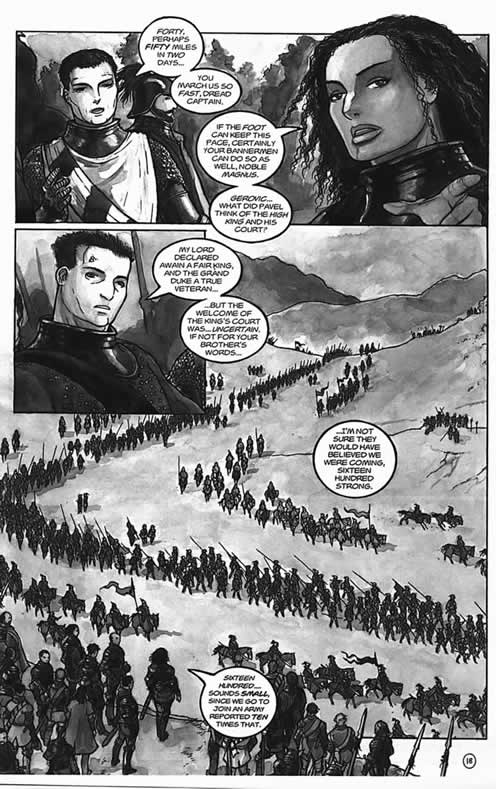
Heroic proportions are covered in many comic art books, which we list within our recommended reader section. Traditionally, stances in heroic representationalism, are usually more imposing; feet are often wide apart, chest is usually thrust forward. Heroes are more often attractive than not (in any visual storytelling media) and seemingly powerful.
Copyright: Septerra Core is TM & © 2000 Valkyrie Studios. All rights reserved. Used with permission.

Heroes always look good in a dramatic pose, but don't always need a weapon or superpowers.
© 2000 BOXTOPTV.COM. All rights reserved. Used with permission.
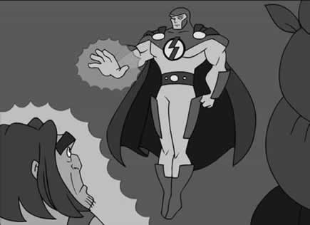
Severe Camera Angles
Above and beyond the aforementioned very high and very low eye level forced perspective, or the "camera lens" in tight on the subject. Scenes that are shot with a "Fish eye" lens or extreme close ups (usually on faces but can be on any suitable subject), create an immediate effect. Figures XX and XX provide an example on how severe camera angles can add value to the visual storytelling process.
A dramatic point of view from the Septerra Core RPG game.
Copyright: Septerra Core is TM & © 2000 Valkyrie Studios

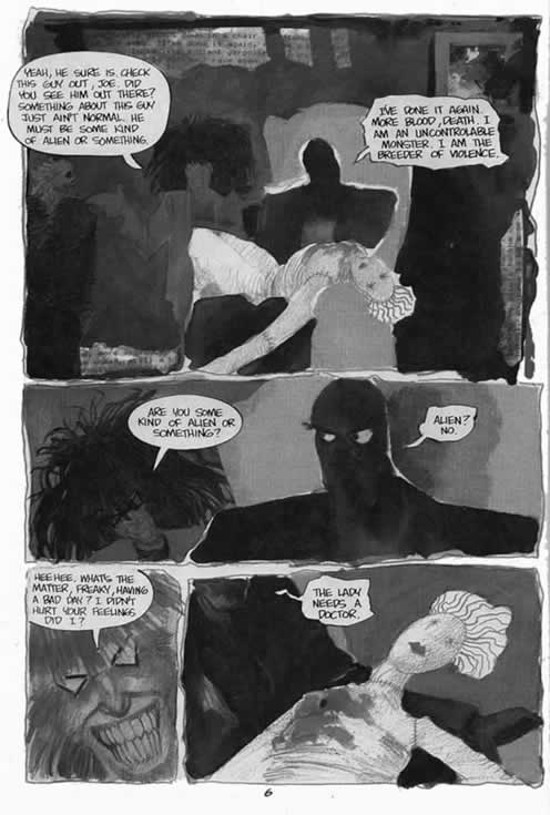
The "camera lens" can be tight on the subject, framed by the borders of the panel or screen.
Copyright: Strangers in Paradise is TM & © 2001 Abstract Studios. All rights reserved. Used with permission.

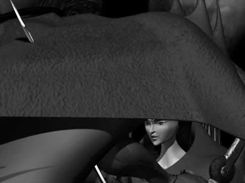
A dramatic look downward from on top a human captive.
Copyright: Operation Extermination is TM & © 2001 CWS Studios. All rights reserved. Used with permission.
Tilted panels
It's often recommended to use tilted panels sparingly, as it can easily confuse the audience (or make them sick) and loses their special effect if overdone. Always use with storytelling and eye path clarity in mind, but either the horizon within a normal panel can be tilted or the panel as a whole. This is usually an indication that something is amidst or "crooked."

© 1989 Sony Pictures. All rights reserved. Used with Permission.

In the above figures we see an example of using a tilted panel with motion lines, indicating shaking while the one below has a dramatic tilt to let the reader know something is amidst.
© 2001 BOXTOPTV.COM. All rights reserved. Used with Permission.
Special Effects
There are a variety of special visual effects, many unique to comics, but the visual effects can be and have influence other media. Here are only a few:
Radiation lines
Common to the comics, these are also used in many interactive games, such as Paperboy, Quake 3 Arena, or Revolt, where the character or object has either achieved certain power status or is being attacked by some mystical force that adds an aura of light around them. The glowing effects of the comics have transcended into all forms of visual media.


The highlighted lines used to depict magic, power, energy and a plethora of other events that may be difficult to present in any other way.
Copyright: Paperboy N64 is TM & © Midway Games & High Voltage Software. Comics art is © 2001 Anthony C. Caputo and the Age of the Guardian Strangers scene is TM & © 2001 BOXTOPTV.COM.
Speed lines
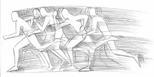
The augmentation of the implied movements of characters with "speed lines" are an invaluable aid to an artist, whether on the static page or even in dynamic visual storytelling. They can, however, be overused. Never rely solely on this device to portray speed (see multiple images). The acting of characters (poise, balance, coordination, gestures, etc.) should always be convincing and can also present speed and motion. Remember, that the lines are not really there and are an after image of whatever is set into motion, and should serve to clarify the action, not create it.
Impact lines
Impact lines are handled like explosions whereas the lines radiate from the point of impact (for crashes) or center point (such as a surprise) and should be treated like a lighting effect. Although, it's best to insure the action calls for it, as if used inappropriately, they can distract the reader from the story itself. Impact lines dramatize the actions by using a visual exaggeration of the contact or emotion.

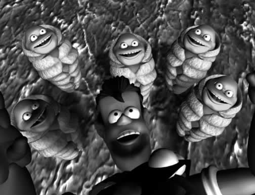
Here we have impact lines emphasizing the attack and power of the punch that knocks the zombies off our hero.
Burst effects
Explosions are done with radiating diagonal lines, which are actually a combination of compositional lines (which are "invisible") and rendering that indicates light and shade. Explosions are usually bursts of light, and easy to do by treating its energy source (or center) as a single light source.

The use of lines to mimic an explosion can add dramatic impact to any scene.
Kirby Krackle
The "Kirby Krackle" is a method of presenting power or energy, created by Jack Kirby. There have been many elements to comic books that Jack Kirby has contributed and has influenced other media in general, but this one is clearly all his own. Its simplicity is lost in the dramatic effect it provides the reader (and the interactive players that it's inspired). Crisply laid out "particles" radiating from the power or energy source gives the figure or object a unique glow.

Here's a reproduction of the Kirby Krackle, named after the legendary artist who introduced the innovation.
Multiple images
The use of multiple images is used to provide an illusion of movement or speed. Much like the fact that the cinematographer of the television show Six Million Dollar Man, or the filmmakers of The Matrix needed to present super speed in slow motion, otherwise, how would the audience see the action? The multiple images of Neo (played by Keanu Reeves), in The Matrix adding and even more dynamic effect to the scene by following the bullets miss him. This multiple image effect has been used in comics since Carmine Infantino first introduced it in The Flash, in 1956.
Said J. David Spurlock, co-author of the Amazing World of Carmine Infantino, "Carmine Infantino's historic 'How I Draw the Flash' (1960's Flash Annual and the Amazing World of Carmine Infantino) includes an absolute, classic example of the artist's innovation in illustrating movement. This technique is more work for the artist, but Carmine felt he needed to develop a new approach to set his co-creation apart from the Golden Age character of the same name, and from traditional comic's motion lines."
Transformation effects
Before the morphing software, and even before motion pictures, there was Richard Mansfield, who played Dr. Jekyll & Mr. Hyde in the first stage play based on the novel The Strange Case of Dr Jekyll and Mr Hyde, by Robert Louis Stevenson, which was first published as a novel in 1886. Although, the transformation from man to beast goes as far back as ancient Greek mythology (always a great resource for inspiration; see recommended reading for books).

Richard Mansfield plays Dr. Jekyll & Mr. Hyde, around 1900
Copyright: Courtesy Library of Congress
Transformations can be something as simple as Superman's quick change from Clark Kent to Superman to Bruce Banner's morphing into the giant Hulk.

By building the transformation over multiple panels, the illusion of passing time and dynamic morphing is clearly presented.
Copyright: Ralph Snart is TM & © Now Comics and Marc Hansen
"Japanese" speed lines
There are as many unique elements to Manga as there are similarities. Once a clear differentiator is the dynamic speed lines that have influence a new generation of artists and have been so ingrained into the art form, that Japanese animation, even the dynamic visual still use speed lines to enhance motion.. These tend to be more linear and precise, immediately indicating movement at such a pace that the backgrounds become nothing but blurry lines.


First there are drama lines, which could be used to emphasize a horrible creature slithering towards a character on the ground. The lines are "energy", representing a movement that is not physical, but emotional. The next is the movement lines, representing the demon's tails rushing through the air and the camera is following them as the background blurs to speed lines. Then, there are the ground lines, which convey the movement of the car towards the camera, almost as if the road itself was moving. These "Japanese speed lines" are also widely used in Anime movies. It's interesting that effects that were created as a necessity to depict camera movement on static paper found their way into the moving picture.
Copyright: Soul Chaser Betty is TM & © 2001 Brian BMAN Babendererde. Used with permission.
The Principal of Thirds
The Principal of Thirds is a methodology for object placement within a visual storytelling frame. Unfortunately, this portion of my book ended up on the cutting room floor, but is an important component of overall design. Typically used in filmmaking, but taught by the instructors at The American Academy of Art in the early 1980s as a guide for object placement when designing on the page or within a frame. If you take any frame—comics panel, ad page, film frame—and divide it into thirds both horizontally and vertically, there are four points at which the lines meet. The eye is drawn to any object within the frame that is centered on one of those points, and thus bisected horizontally and vertically, rather than directly to the geometric center of the composition.

Framing
This constitutes using panel borders and/or objects within a panel to frame panel contents to emphasize what is most important. Things like trees, bridges, windows, characters, etc., the list of things that can used to frame an important object, character, or action, are endless. Using heaving shadows or a different rendering technique can do a lot to emphasize what's being framed.

Blacks can be used to help the reader along the correct eye path and as a visual design element.
© 2001 Jeff Smith. All rights reserved. Used with permission.
Basic shapes
When working out a design, it helps to simplify the forms by using simple basic geometric shapes as depicted in Figure 10.34 (circle, square, triangle, etc.). This will provide a foundation to review layouts and designs before laying down some hard work.
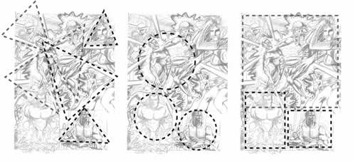
By working with basic shapes within the framework of your images, you can achieve heightened emotional response or provide clarity in eye path.
Figure Grouping
When establishing or drawing groups or crowds of figures, this must also be approached with a true sense of design. Time and again, in comics, a "uniform field" of figures is drawn, creating a boring symmetrical effect. Utilize asymmetrical and balanced asymmetrical designs and shapes to arrange the figures more often. If done properly, this can aid in the storytelling as well as improve the aesthetics of the drawing.
At 15 frames a second, an animated feature would have about 900 pictures to tell the same story as this single page, or about one minute of story. However, because of the "Interpersonal" experience, each individual may choose to experience the page differently. Many may gloss over it in a few seconds, while others may spend a few minutes absorbing the details on the page to add depth to the story.
Spotting Blacks
The distribution of black or dark areas within a scene, or on a comic page as a whole can aid in a unified sense of design. To see clearly what the pattern of black areas looks like on a scene, panel or page, do the same overlay technique used when highlighting negative space. On an overlay, use a marker or computer mask and fill technique, to fill in the areas anticipated will be solid black. The pattern of black areas within a panel should help the aesthetics and clarity of storytelling, form, action, and emphasis of the work.
Use blacks and graphical design elements (shape, color, etc) to lead the reader's eyes in the right direction. This can be done for panels or scenes individually or an entire page as a whole. While the black masses make a drawing seem solid, they also help place focus on important elements in a scene by attracting the eye toward them. Equally important is the use of solid and strong black masses to create dramatic moods within a scene.

Always remember - the placement of black areas creates a definite pattern in every panel. The pattern must never be too complicated, or too busy, or it will confuse the reader. Whenever an illustration causes confusion in a reader's mind, it also causes the reader's attention to be diverted, killing the dramatic mood created. Keep it simple and keep it clear.
Figure Cropping
When a frame or other objects in a frame crop the view of any figures, it should be done in a way that is aesthetically pleasing and purposeful. Cropping a figure inappropriately can be quite jarring to the audience, especially as a reader. Some basic rules to follow when cropping:
- It is usually visually awkward to crop a figure at a major joint (neck, waist, elbow, wrist, knee, and ankle). By cropping a figure off at the neck, it's going to look as if they've lost their head. The same hold true for any of the other joints. By cutting a figure off at the ankles and add smoke to hide the mistake, then the visual storytelling police will personally find and kill you.
- It's better to crop mid thigh or mid shin than at the knee. It's an easier transition for a reader to accept.
- Never crop in ways that negatively affect clear storytelling. The figure's action should always be clear. In other words, try not to crop a figure close to an action that is important to the scene. Never crop out a limb or part of a limb that is important to what is going on in the frame.
Another rule, although not entirely related to cropping, is to avoid having the figure standing on the border of the frame. Doing this will kill some of the three-dimensionality of the work and like anything else, do for a specific reason or effect in mind, but avoid whenever possible—remember, as a visual storyteller the goal is to draw the audience inside and not pull the characters out.

Tangents
Objects within a composition will look awkward if their major contours (usually outside silhouette contours) touch but don't overlap significantly. A character's arm that butt's up against, for example, the frame's border is going to make it look as if the character is leaning on the frame. Another problem tangents cause is pulling the eye to where the tangent comes together like a magnet.
It's better to overlap the forms or objects or separate them completely. As long as they don't just touch each other's contour. Doing this can pull figures or objects together onto the same plane, even if they're supposed to be hundreds of feet apart. If overlapping two figures or objects, make sure there is no doubt about their position and depth.
Scott McCloud, in his book Understanding Comics, listed a series of standard categories of word-and-picture formulas in visual storytelling for comic books. However, as depicted in the few examples that follow, these transcend any visual medium.
(1) Word or Script specific, where the picture illustrates, but does not necessarily adds very much to a fairly descriptive text.
(2) Art or Picture Focus, where the words act as little more than a soundtrack for the pictures of a visually told sequence.
(3) Duo-Focus is where the words and the pictures are conveying the same message, which tends to be overkill, but if used wisely can be an added benefit to further characterization. As John Byrne mentioned in Chapter 9, the artist's job is to put the writer out of business. So what happens if in a duo-focus example, there is a script describing a typical action scene where the villain opened fire on a hero with a sawed-off shotgun. The original dialogue read: "I'm going to blow your head off!"
If the artist actually draws the villain shooting the hero's head off, it's superfluous to have the character still say: "I'm going to blow your head off!" The artist has already visually informed the reader of this fact. Thus, the artist can change the dialogue to something that can add more suspect, drama or subtext, such as, "Why won't you just die!" or something that is story specific. (4) Elaborate Combos are when the words elaborate or expand upon what is being said in the picture, or vice versa. An example of this is a couple walking down a romantic beach hand in hand and they're telling each other how happy each of them are to have found the other. (5) Parallel combos are analogous combinations of words and pictures with little to do with each other. The pictures are telling one story, while the words seem to be telling another. The Montage is a seamless combination of words that become an integral part of the picture. The montage is a visual (usually large) that has a number of juxtaposed elements (along the line of most movie posters). Those elements should, ideally, be arranged in a manner that takes eye path, storytelling, and emphasis into account. A common montage composition mistake of many artists is the "uniform field". This is where the elements in the montage are fairly evenly arranged on the page. What happens then is not only a very boring layout, but the reader becomes unsure of what is important on the page, and the composition will fight the eyepath of the reader, causing them to be unclear as to what panel/element should be viewed next.

- Super-Imposition - running one or more images over another image. Again, clarity of eye path, action, storytelling and emphasis is important.
- Inset panels - can be effective if used sparingly and if they incorporate all of the elements of good comic book design.
- Controlling the reader's eye - by using the lines of action, dialogue placement, overlapping, and so on, the artist can help the reader's eye along its natural path.
The category that many industry professionals have seen as the most commonly used application of comics storytelling is called "interdependent." This is where the words and pictures act together to convey a thought or idea that neither could have expressed alone. This combination isn't always completely balanced, and any given panel may rely more on words than pictures, or vice versa, to get its point across. However, the most effective comic book stories are where the writer and artist work closely together to push the art form to its boundaries, or the writer and artist are one in the same, and a master of the medium. Again, as with any form of collaborative production, communication between the team members can be a vital addition to the completed product.
It is not unusual for a writer to picture a character or scene in one fashion, and, if not completed expressed within his script, have the artist draw it completely different. This can be a better expression of the writer's concept. Nevertheless, there may be specific attributes to the writer's thought process (maybe for a future issue's plotline), which make these decisions best determined by both co-creators.
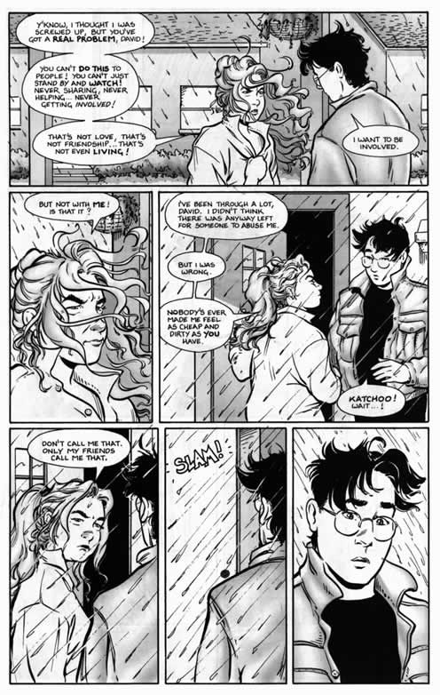
Copyright: Strangers in Paradise is TM & © 2001 Abstract Studios. All rights reserved. Used with permission.
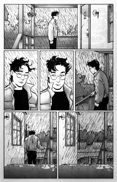
The dynamics that are drawn by the artist do not necessarily involve "action" or dramatic foreshortening figures. These two pages have energy because of the position of the figures and the wind that's blowing their hair around.
Copyright: Strangers in Paradise is TM & © 2001 Abstract Studios. All rights reserved. Used with permission.


